Flux Apartments
A brand shaped by modern design, sustainability, and the rhythm of downtown Des Moines.
Concept Direction / Art Direction of Digital & Print / Production / File Management / Press Check
Client: Roers Companies
Challenge
FLUX needed a brand that would resonate with young professionals drawn to a seamless work–play lifestyle—balancing its industrial design, elevated amenities, and skyline views in a way that felt both aspirational and attainable.
Approach
I developed a bold, modern identity built on clean lines and vibrant color, paired with imagery and messaging that reflect the energy of urban living—highlighting loft-style interiors, rooftop spaces, and a connected, social lifestyle
Outcome
FLUX exceeded leasing expectations, achieving 70% occupancy before completion—exceeding the 50% target and signaling strong market demand.
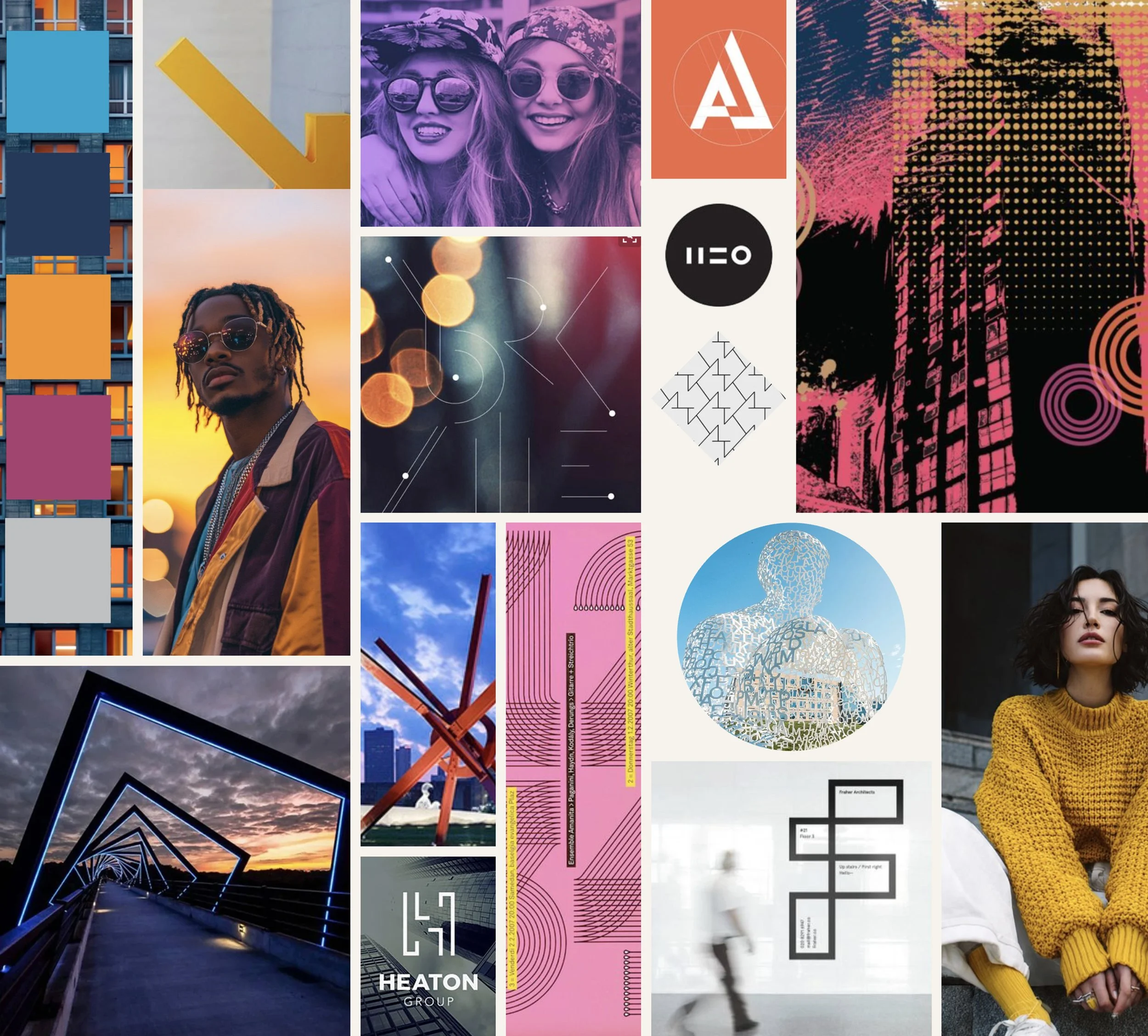
Mood Board
Logo Options
-
![]()
Option 1
-
![]()
Option 2
-
![]()
Option 3
-
![]()
Option 4
-
![]()
Option 5
-
![]()
Option 6
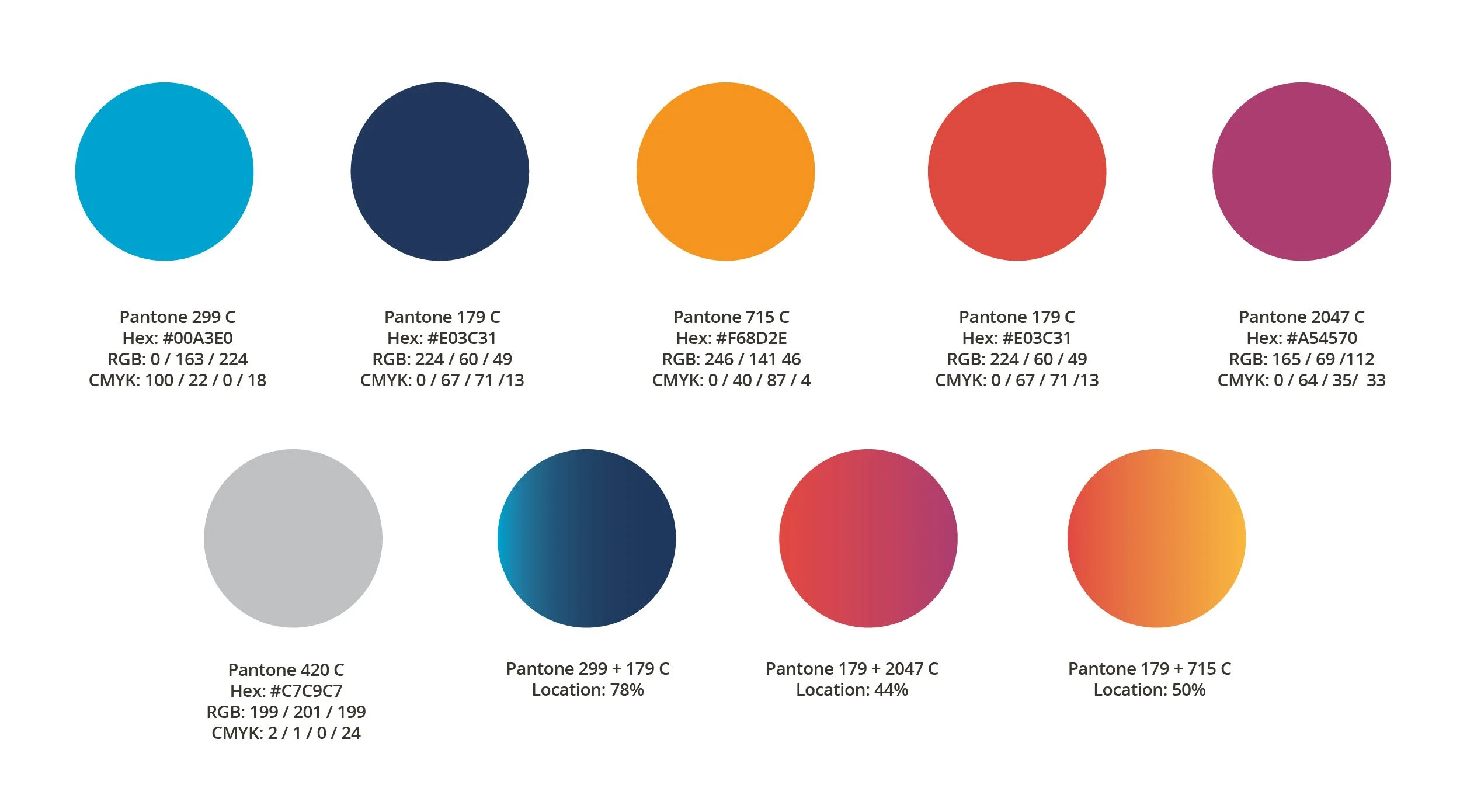
Color Palette
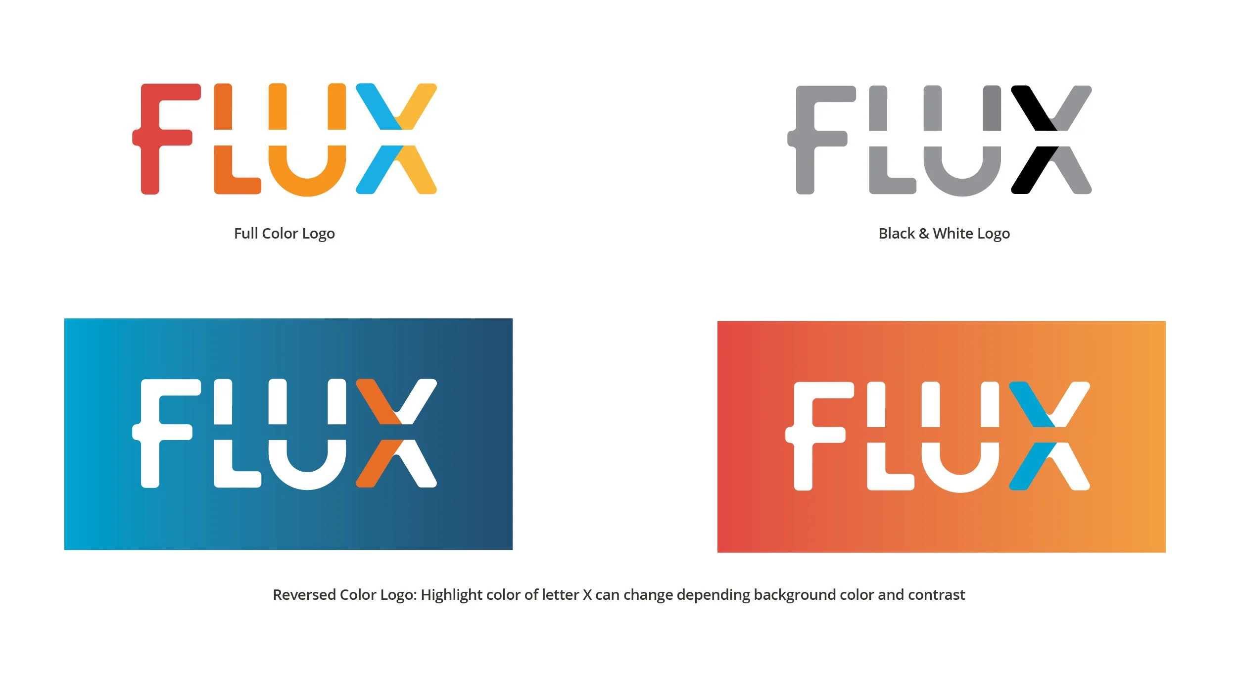
Logo Options
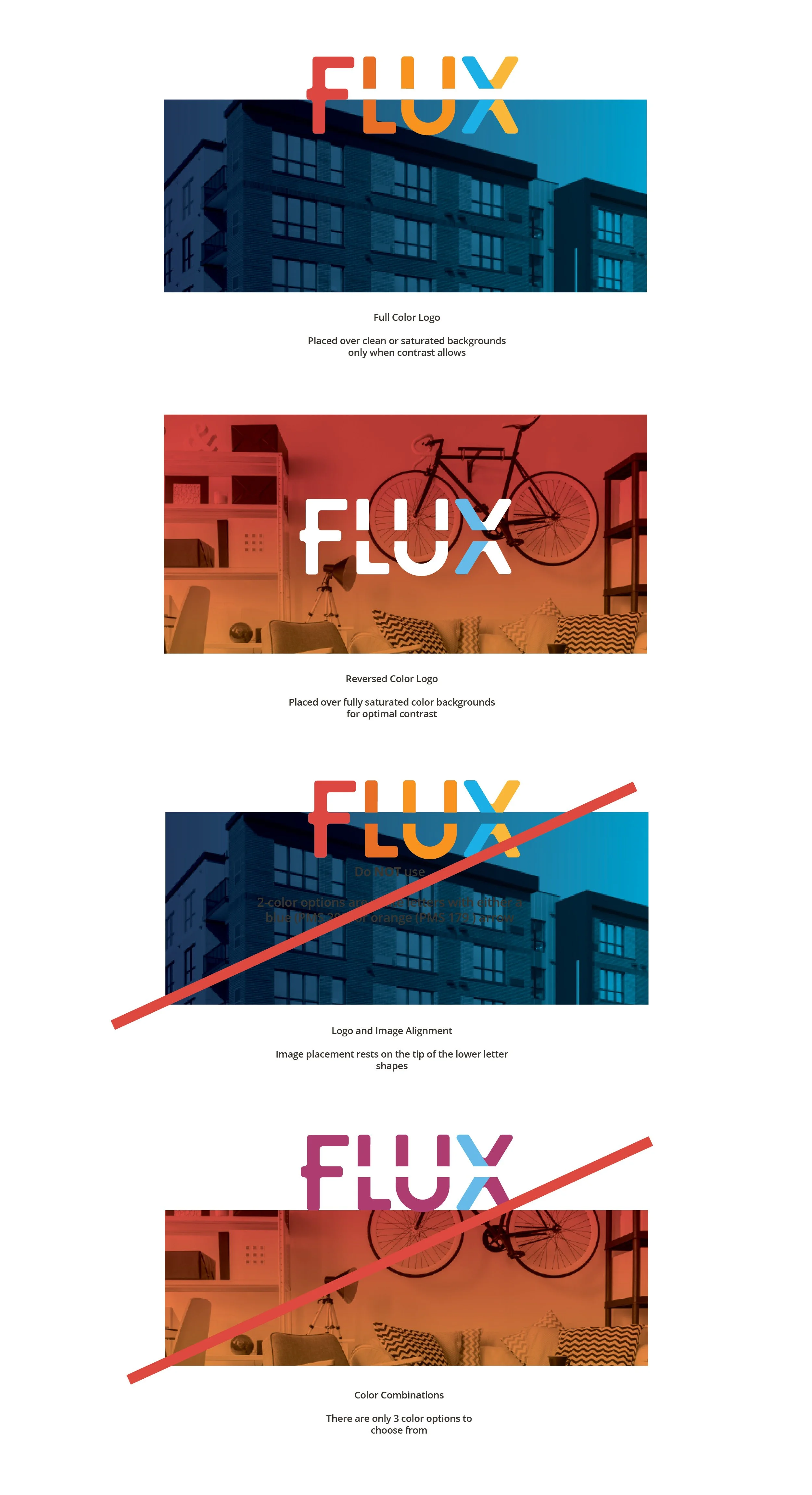
Logo Do’s & Don’ts
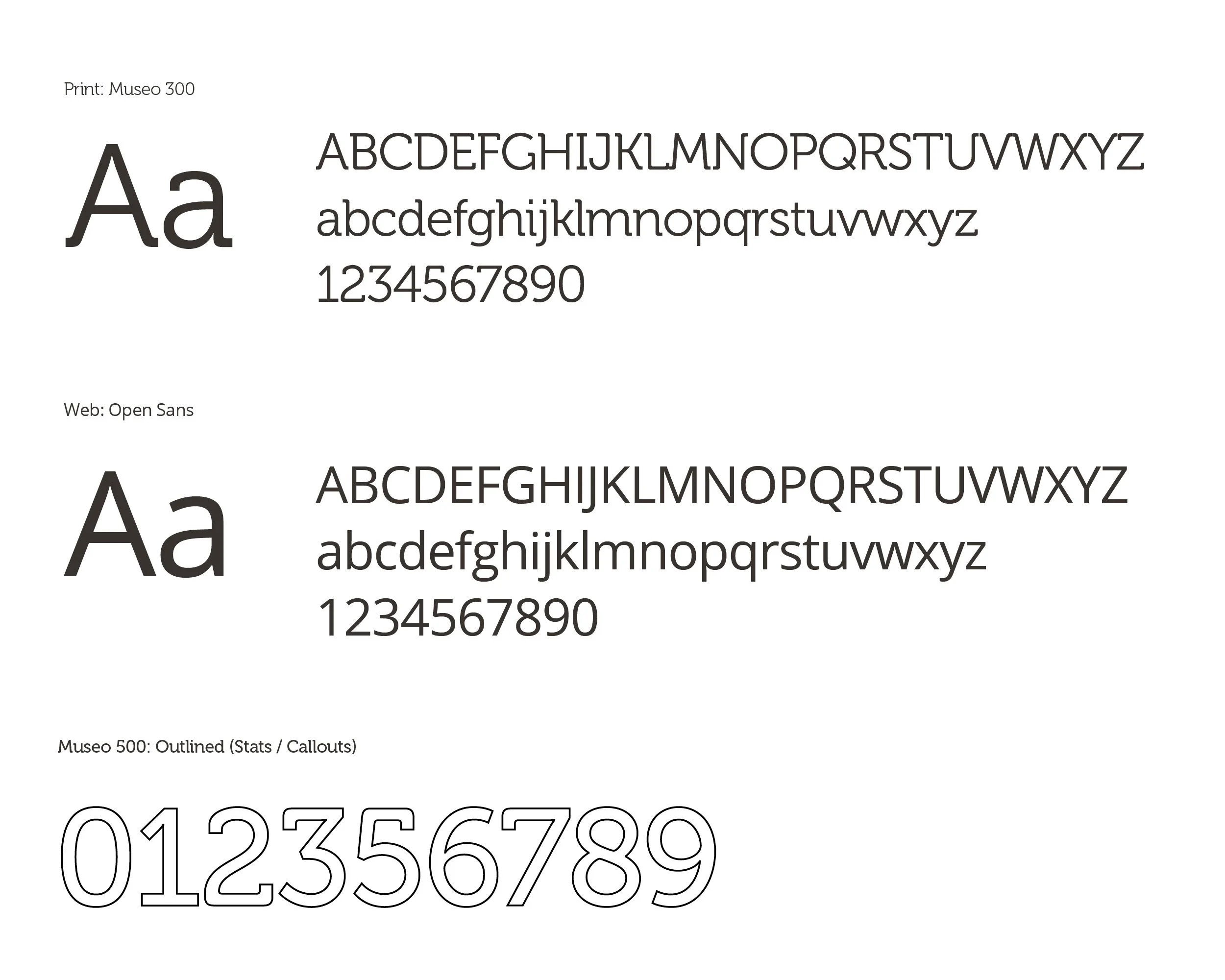
Typography
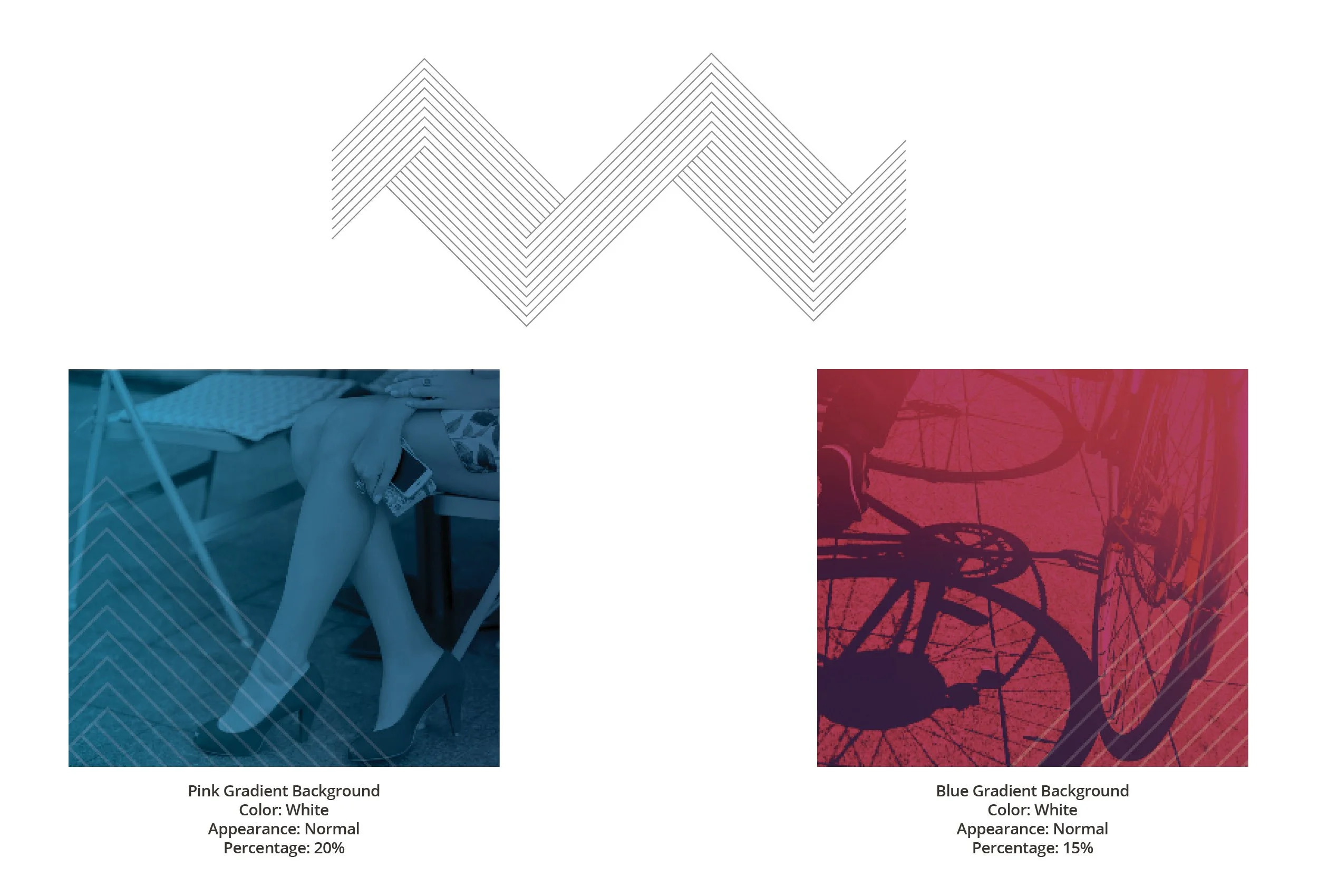
Element / Texture
CTA Buttons
Brand Assets


Additional Branding Projects
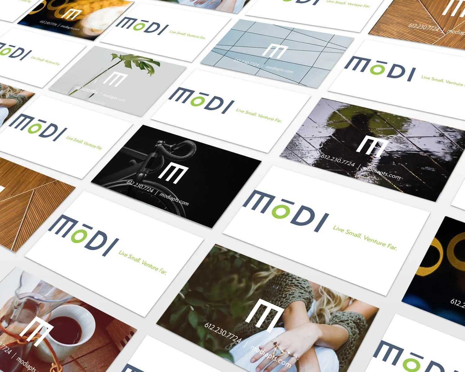
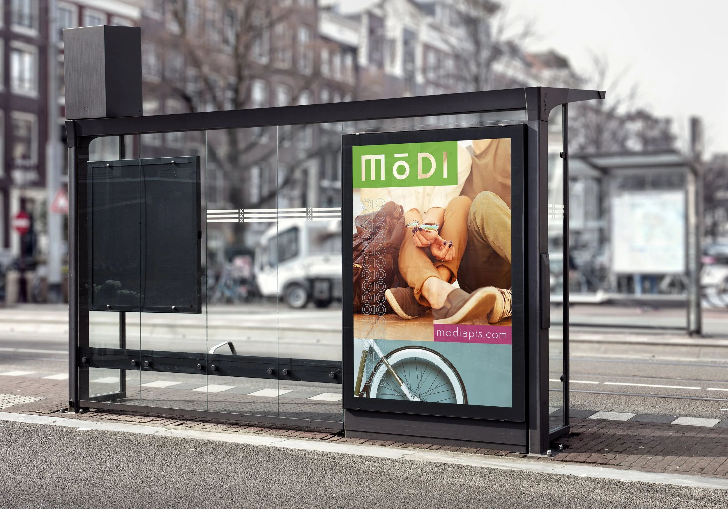
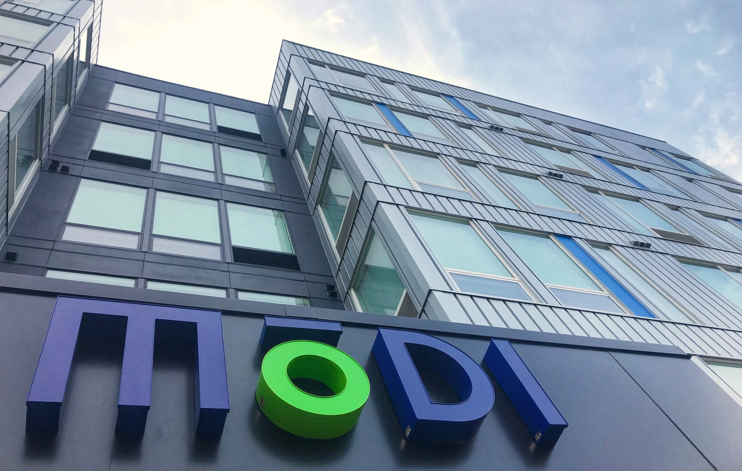
Modi Apartments
Concept Direction / Art Direction of Digital & Print / Production / File Management
Client: CPM Developers
Overview
Modi is a micro-apartment community for young urban residents who prioritize location and mobility, embracing cozy spaces in favor of a life on the move.
Approach
Built around the idea Live Small, Venture Far, the logo mark, color palette, and imagery celebrate minimal living, adventure, and a simple aesthetic.
Outcome
An early website launch and strong social push drove an 18% increase in qualified leads from the target audience in the first quarter.
Homepage
Mobile View
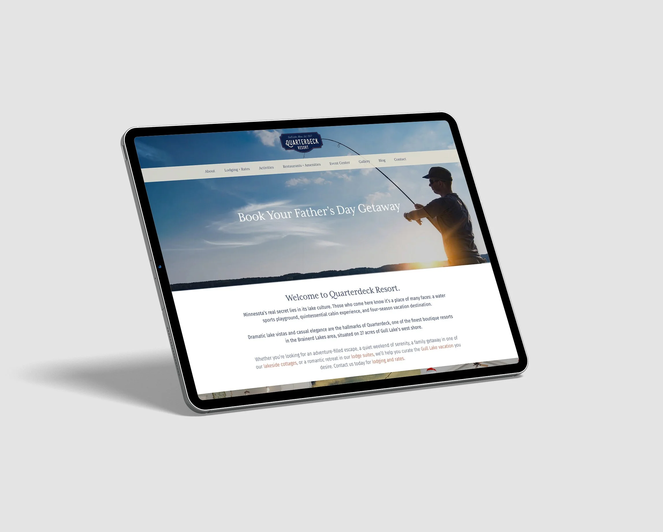
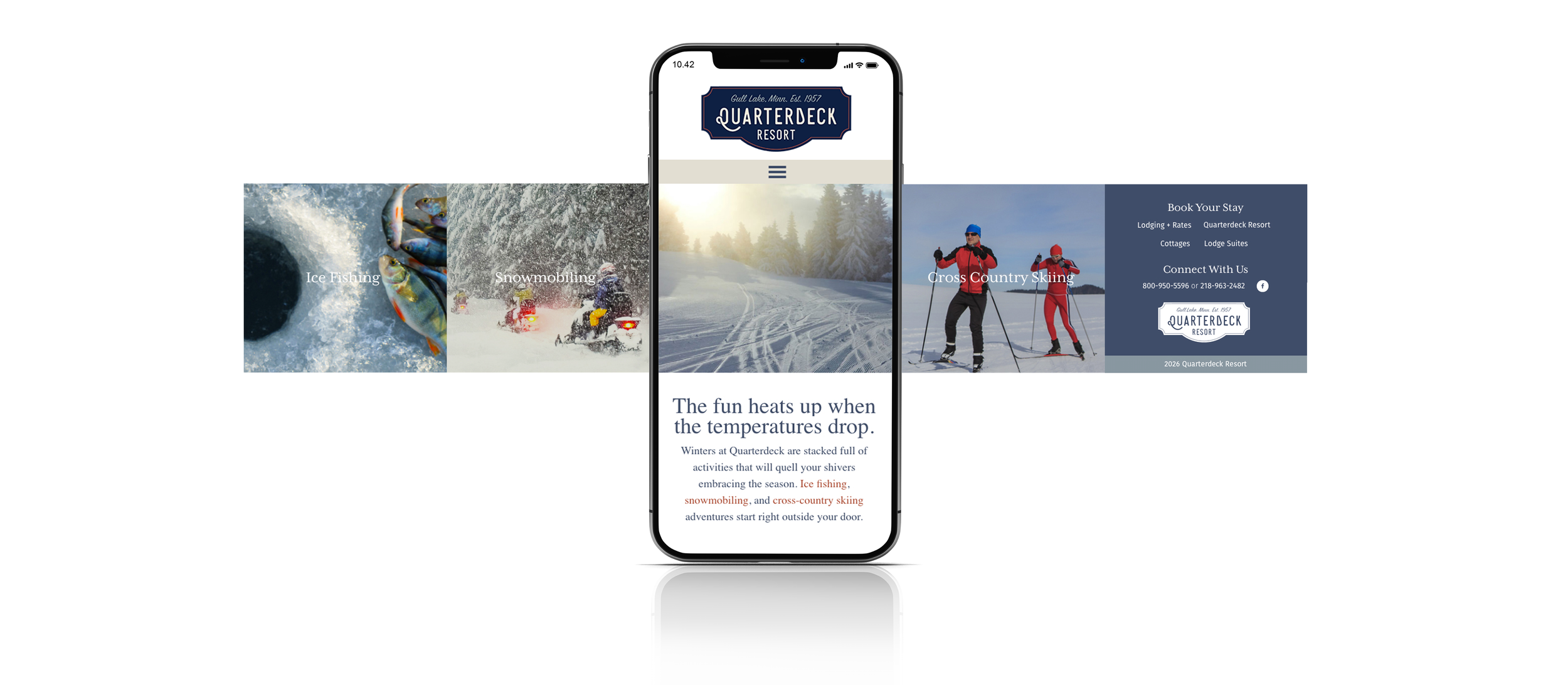
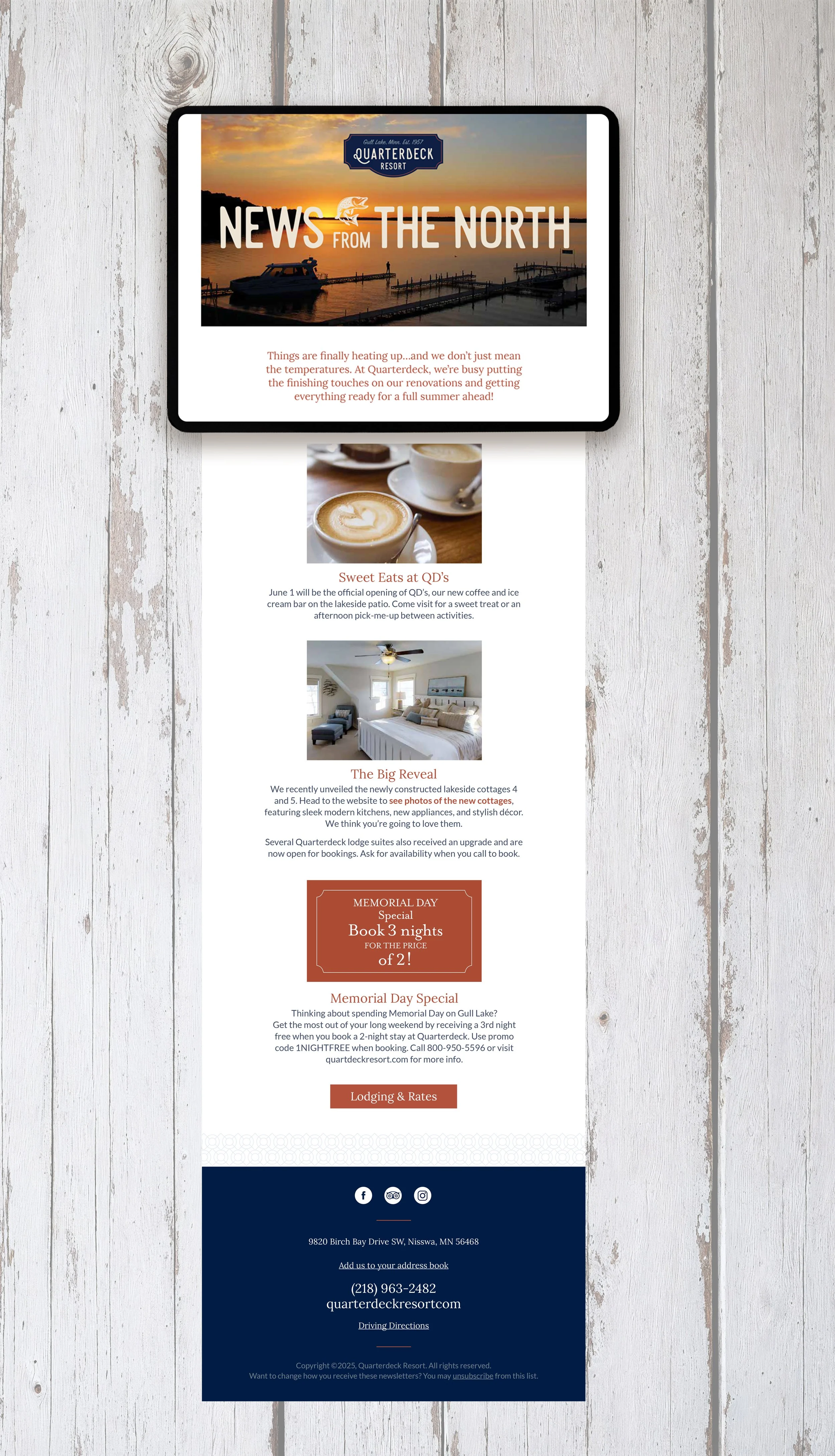
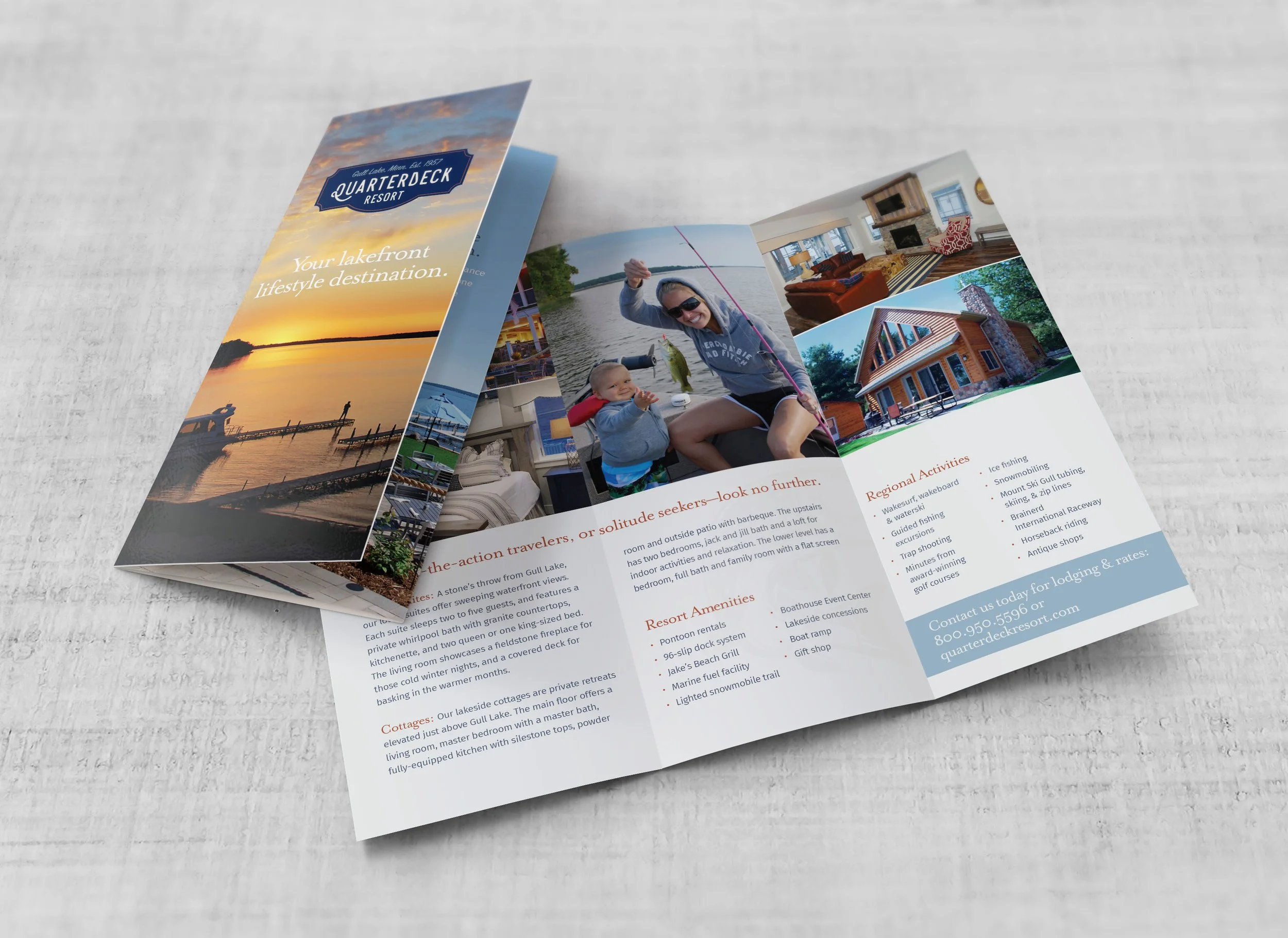
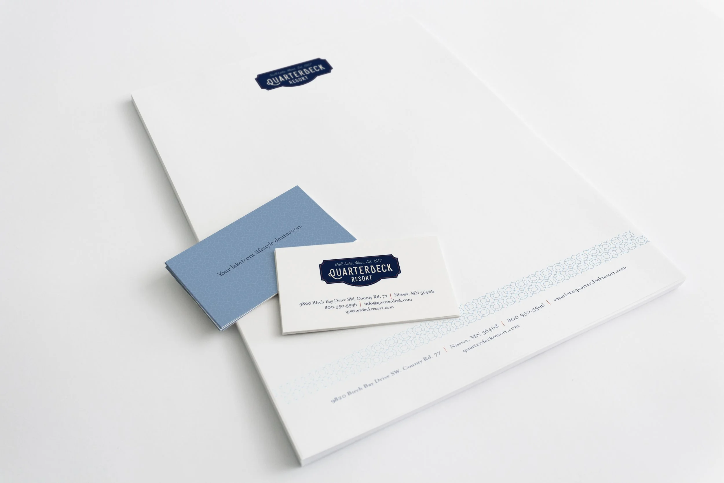
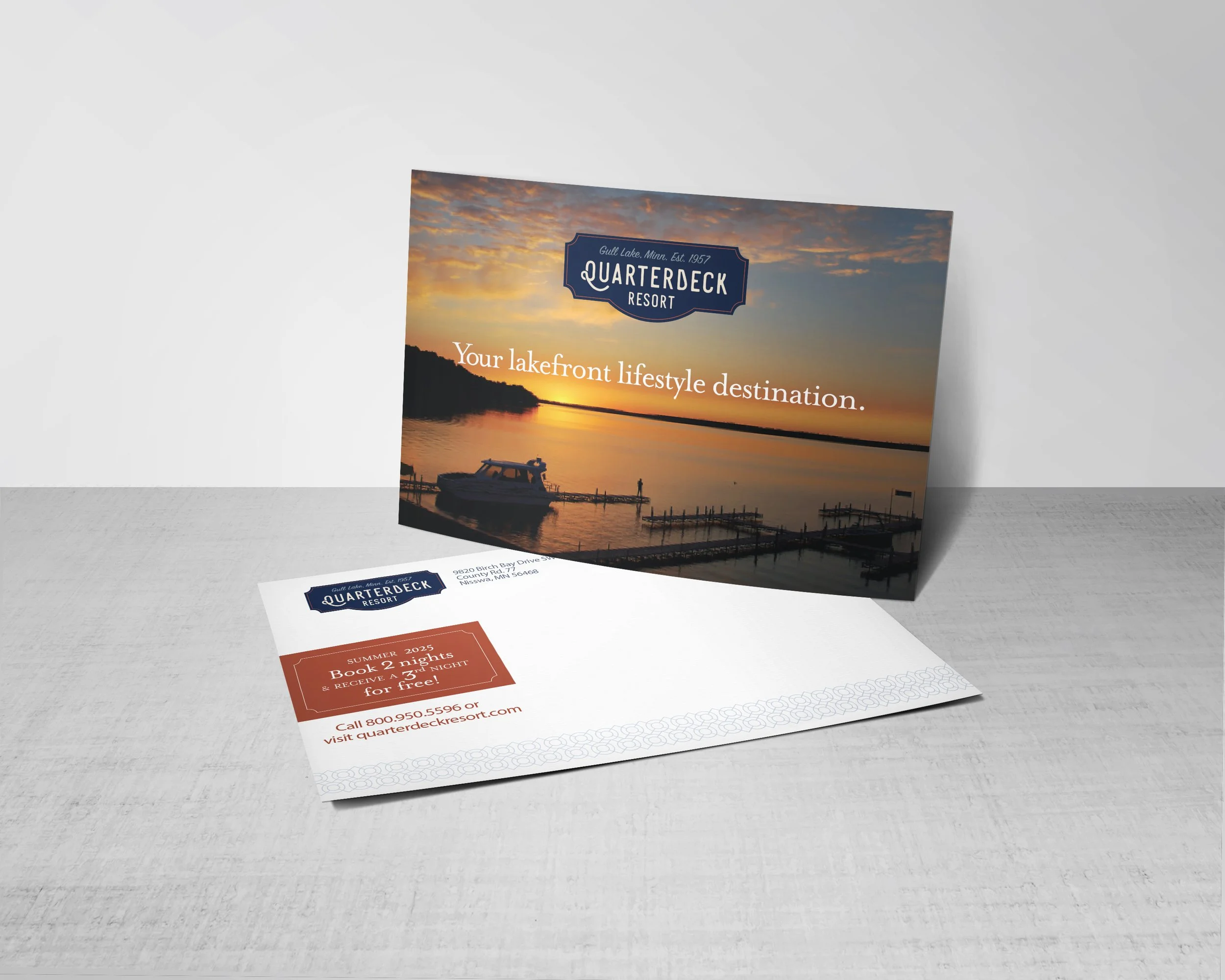
Quarterdeck Resort
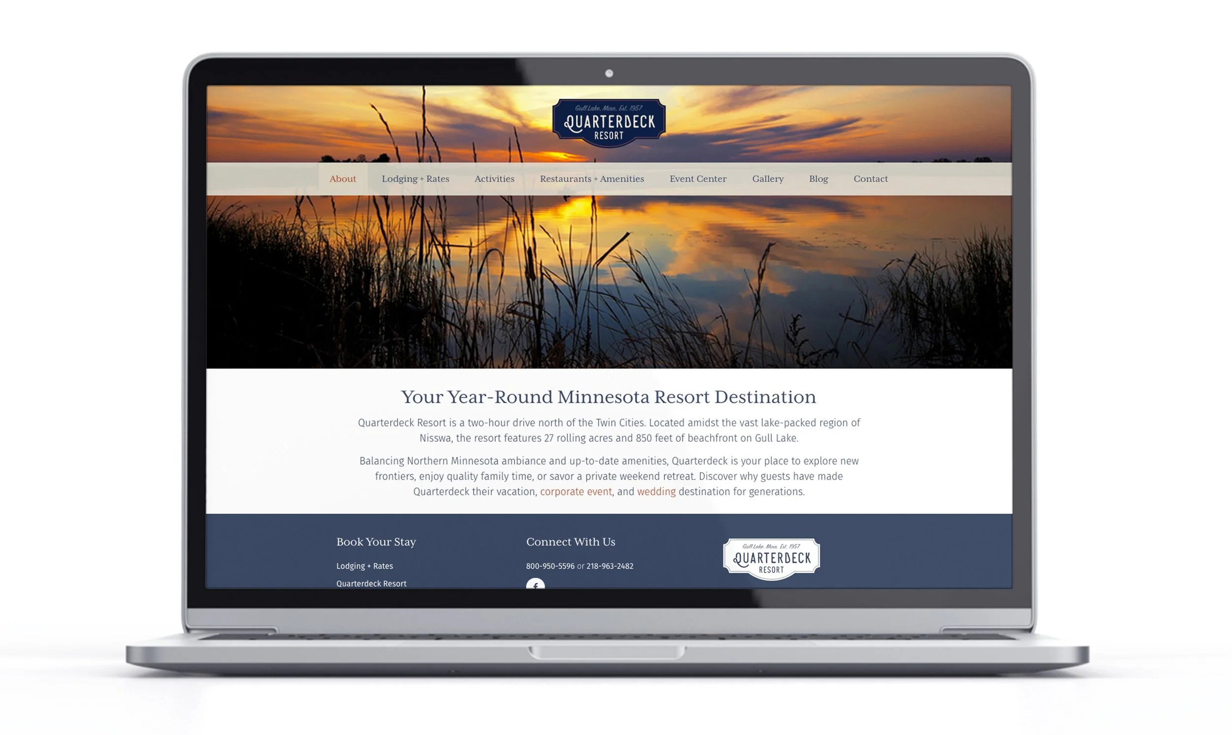
The Quarterdeck Resort identity blends nostalgia and relaxation, with a logo inspired by a vintage 1950s boat emblem. Soft tones and classic nautical elements, combined with a clean, structured layout, make trip planning effortless.